MyScore Mobile App
UI/UX Design | Concept | Research | Interactions
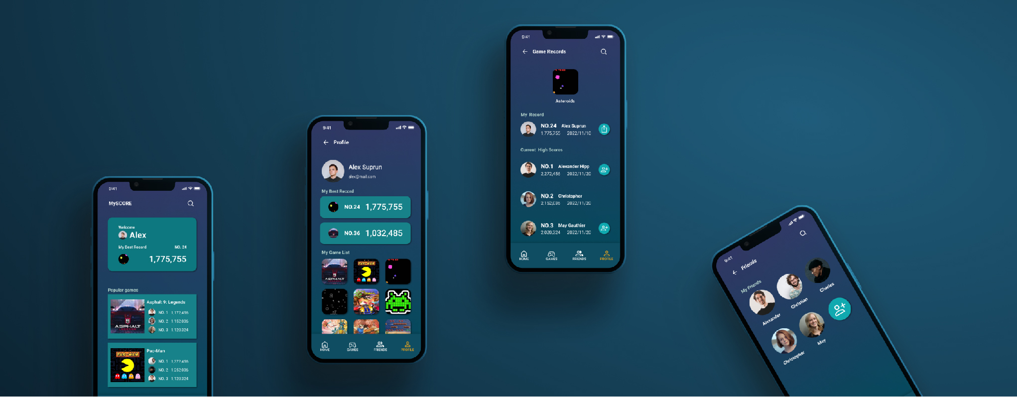
MyScore is a high score tracking app to to attract and retain customers in the arcade games market. MyScore strives to offer the best platform to players keep and track their score in arcade games and engage with other players in their favorite arcade games.
The problem
The arcade players couldn’t track their scores and share their breaking scores with others.
The goal
Design an app for arcade games that allows players to easily track and share their fantastic scores.
User research : summary
I conducted interviews and created empathy maps to understand the users I’m designing for and their needs. A primary user group identified through research was the arcade games players that play at least once a week.
User research : pain points
1. Forget Records Players always forget their records after they leave the arcade games.
2. Can’t keep tracking their scores Players enjoy playing the same games and want to keep tracking their scores and ranking in the games.
3. Want to share with others Players want to be able to share their successes and challenge with their friends or families.
Wireframes
Paper wireframes
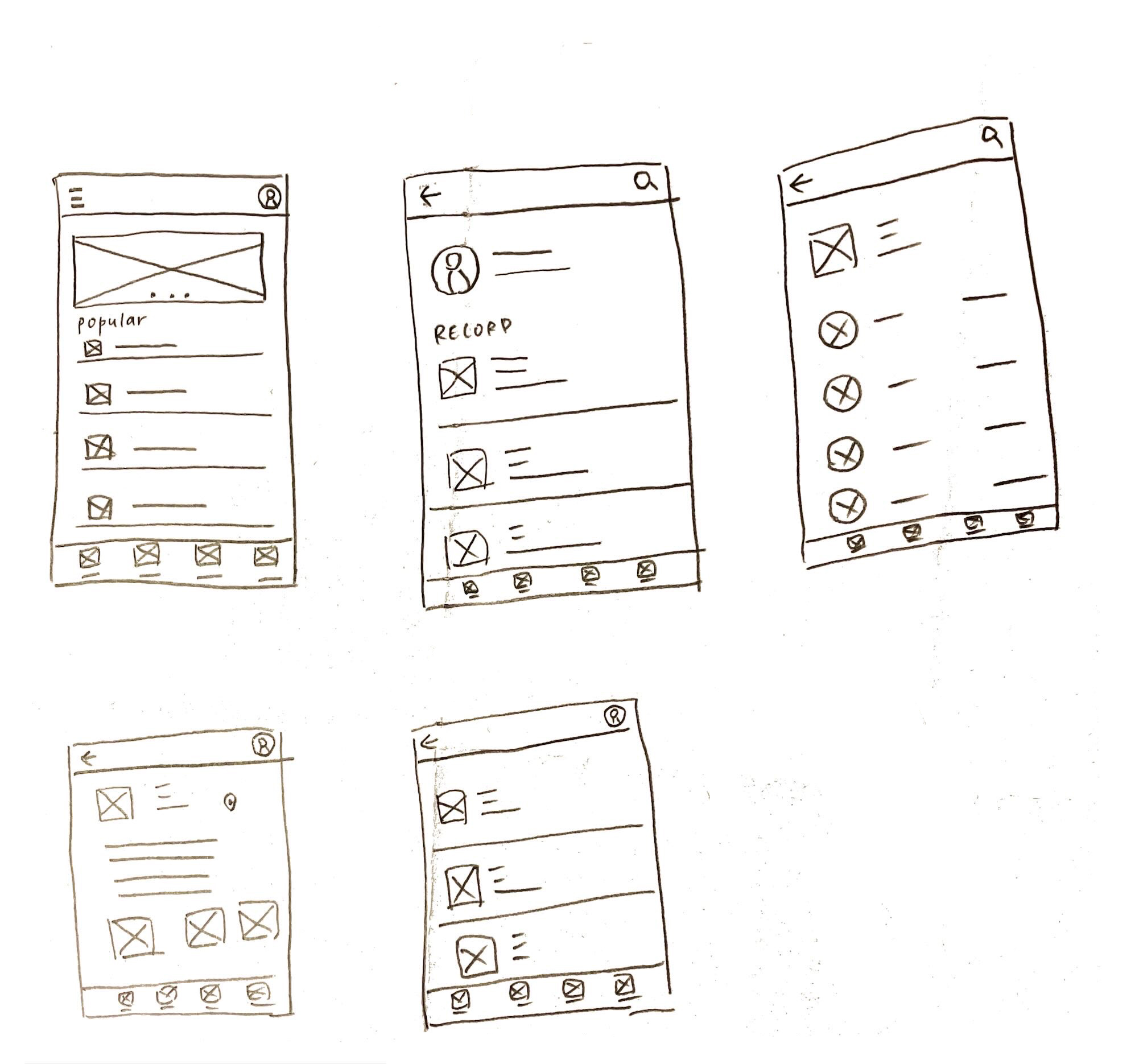
Taking the time to draft iterations of each screen of the app on paper ensured that the elements that made it to digital wireframes would be well- suited to address user pain points. For the App, I prioritized four main features’ button to help users save time.
Digital wireframes
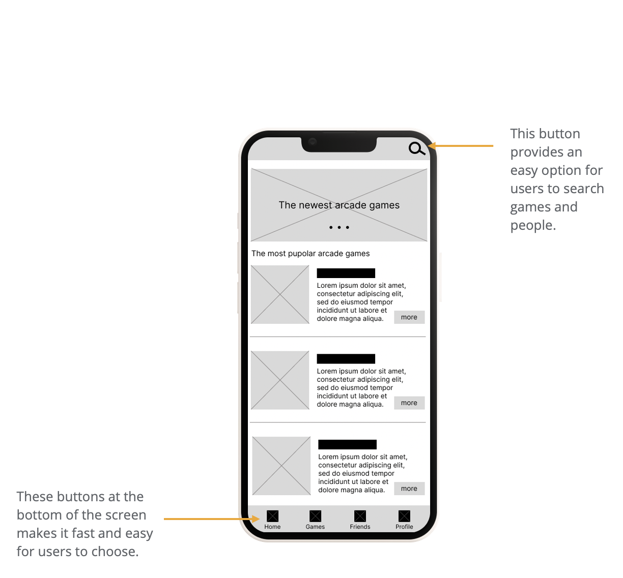
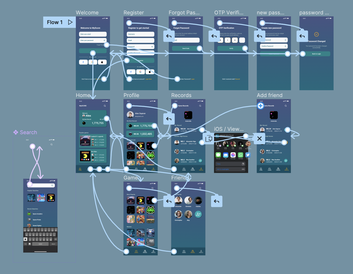
As the initial design phase continued, I made sure to base screen designs on feedback and findings from the user research.
Usability study: findings
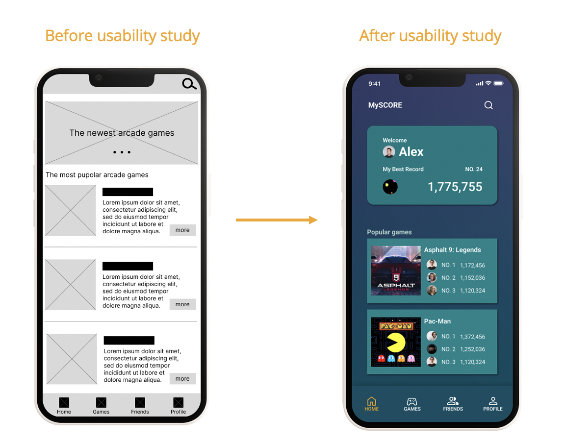
I conducted two rounds of usability studies. Findings from the first study helped guide the designs from wireframes to mockups. The second study used a high-fidelity prototype and revealed what aspects of the mockups needed refining.
Round 1 findings
1. Users want to check the scores quickly
2. Users want more arcade game score information
3. Users wants the icons for identifying every button
Round 2 findings
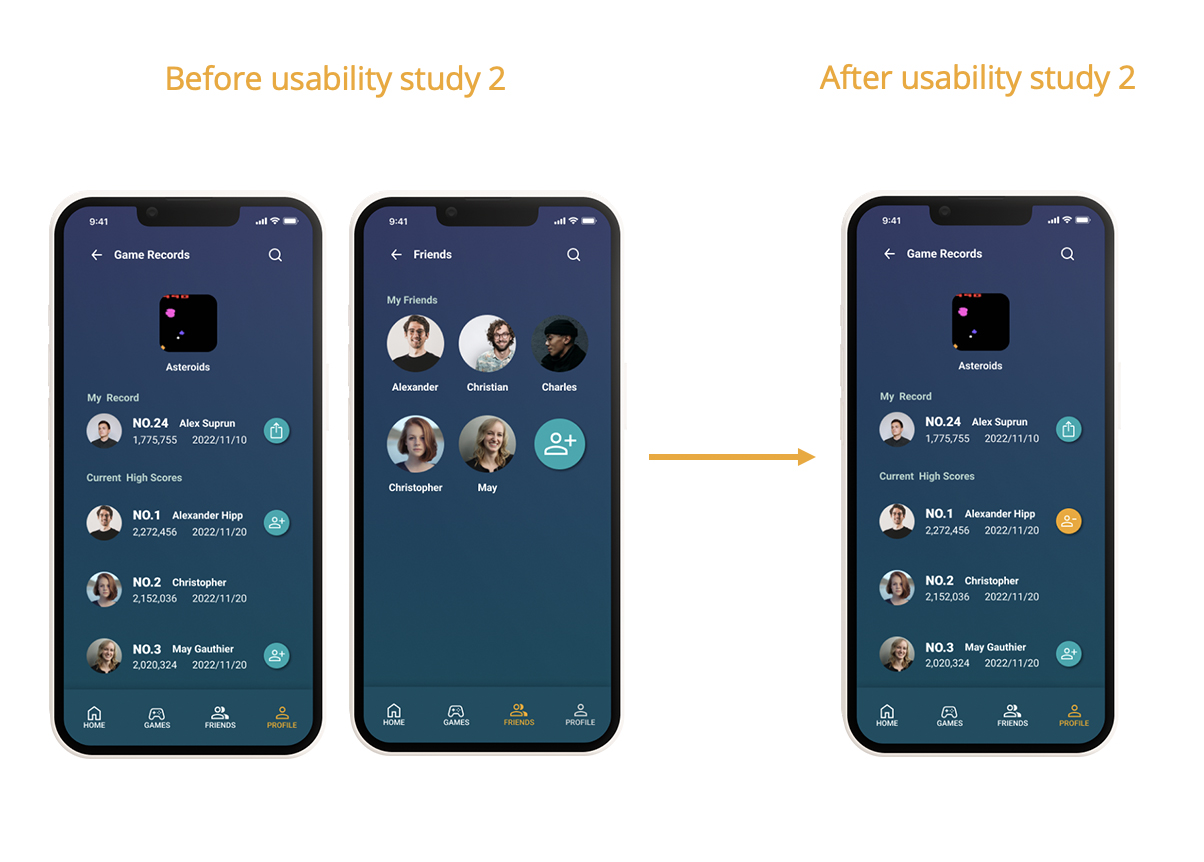
1. Users wants to cancel friend request.
2. Users want to have a favorite list that they can collect their love games.
Mockups
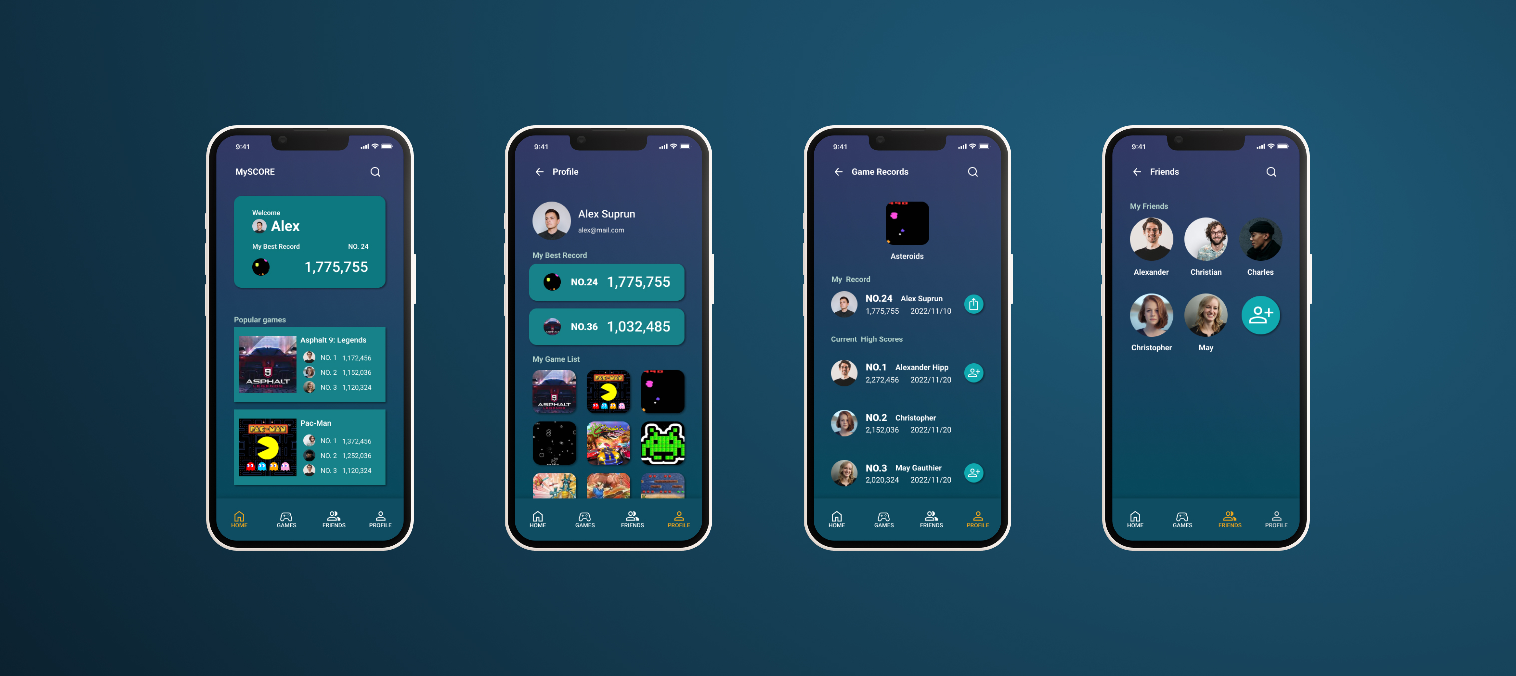
Early designs allowed all the arcade games information for users, but after the usability studies, I added user’s score information to check the score more easily. I also revised the design so users see the highest scores and more arcade game recordswhen they first land on the screen.
The second usability study revealed frustration with the add friends flow. To streamline this flow, I consolidated cancel friend request to this screen.
Accessibility considerations
1. The Contrast Ratio of all screen reach the AA level.
2. Used icons to help make navigation easier.
3. Used detailed imagery for games and toppings to help users better understand the designs.
What I Learned?
While designing the MyScore app, I learned that the first ideas for the app are only the beginning of the process. Usability studies and peer feedback influenced each iteration of the app’s designs.
Next steps
1. Conduct another round of usability studies to validate whether the pain points users experienced have been effectively addressed.
2. Conduct more user research to determine any new areas of need.