Wellcom 24 Online
Product Designer | iOS and Android App
Wellcom 24 is an local groceries retailer.
In this project, we approached a brief to design an e-commerce platform for their products and conventional delivery service. The App would provide an alternative means to buying products from supermarkets.
I collaborated with another product designers (Sticker), product managers (Melodie), and 6 engineers (Warrick, Alex, Hubert, Ada, Kid, Eric) throughout this project.
The Problem
More people are making online purchases every year, and Wellcom 24 recognized this trend as an opportunity to create an app that simplifies the process.
With just a few clicks, users can purchase items and have them delivered directly to their homes, thanks to the Wellcom 24 app.
Goal
A delightful, consistent consumer experience
User friendly app with good content strategy so products easy to buy and information read.
Use design system to reduce technical debt, and give our consumers a better, consistent experience.
Research
Before we started designing, we deep dive into existing behavioral and purchase data of our users to understand them better.
We interviewed 5 people aged 22-46 who are either full-time student or employees, and identified what is the main point that our customers using our product for.
I asked question about
1. Where do you usually shop for food?
2. How important is it for you to shop in local independent retailers and support the local business community?
3. Do you have any children in your household?
As a result, we identify what functionality to include in the app and define the core user journey. Our core user journey:
1. Look for a snack foods.
2. Add the products to the shopping basket.
3. Provide user details and delivery details.
4. Pay for the product.
User journeys help us identify key actions within the app and what screens to focus on first.User Flow
User flow shows how a user navigating through the app.
Examining user flows help build a better user experience and as a result a more successful end product whilst focusing on the needs of the users and how they make decisions.
This flow would then be designed and built into the end app.
Wireframing
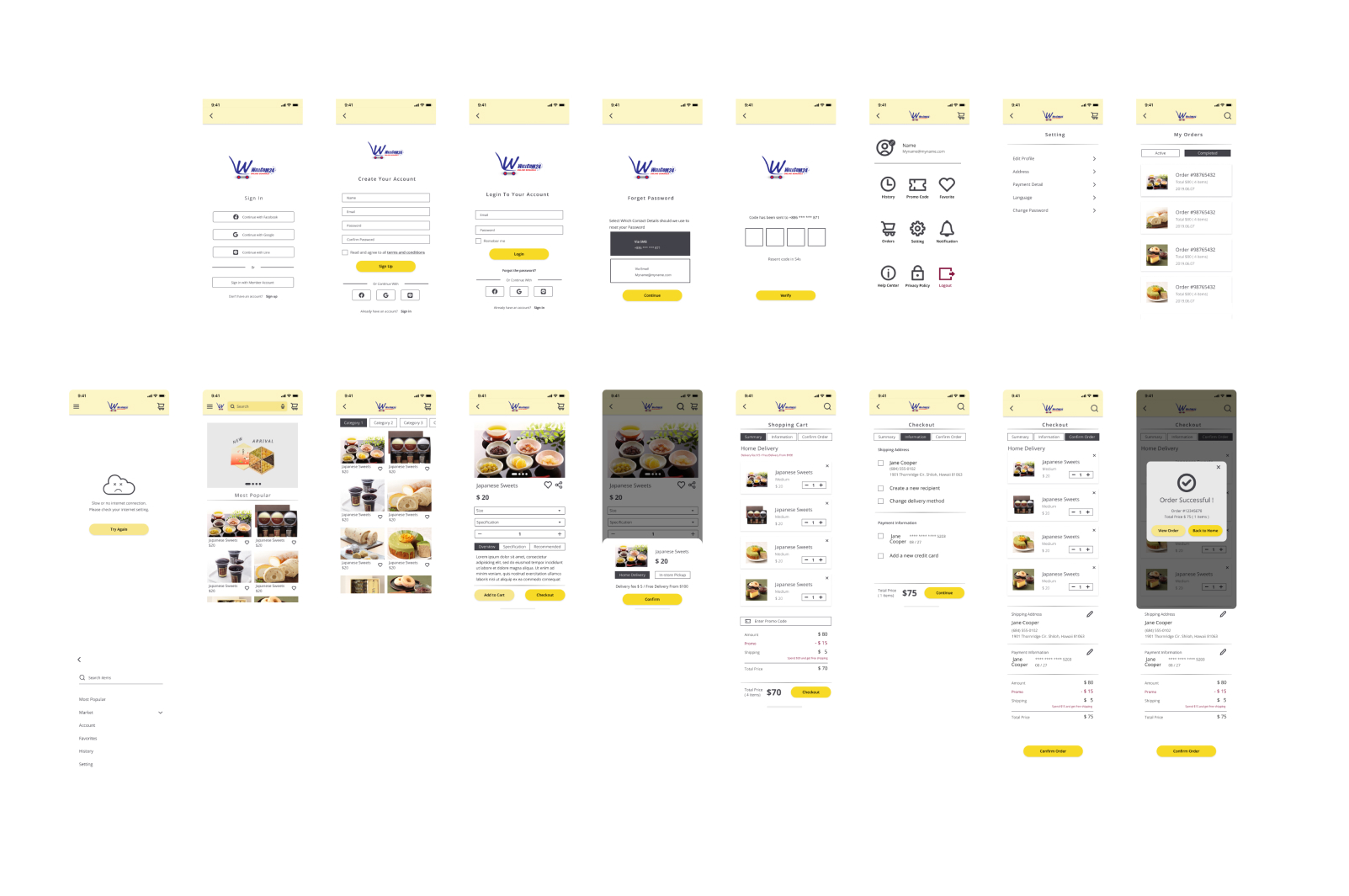
I created the low fidelity wireframes based on the user flow.
Usability Testing
To validate our designs or test prototypes, we did customer interviews remotely. We've tested the prototype with 5+ people in a controlled testing environment.
Findings :
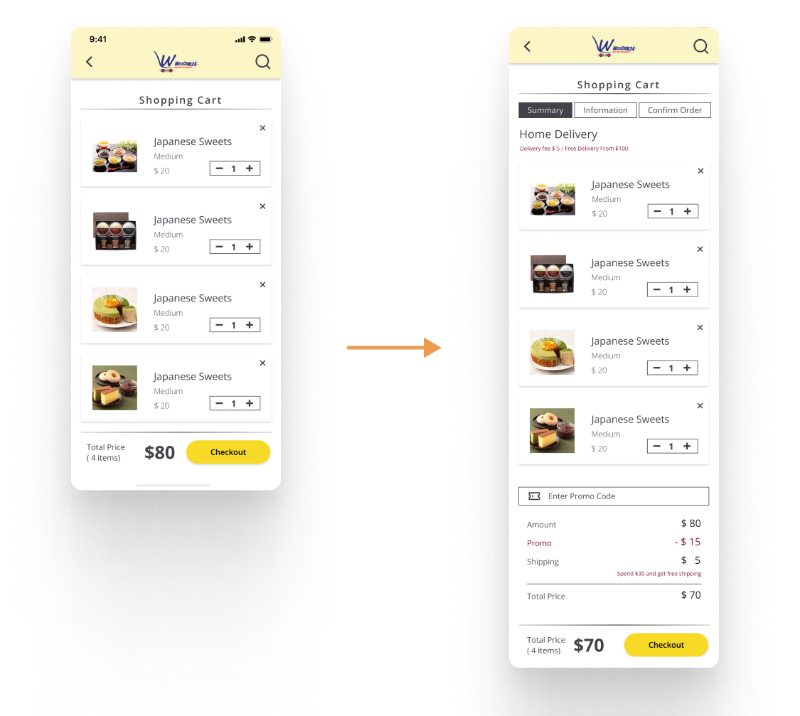
1. Users want to the extra costs were transparent and shown up-front.
2. Users want to search items much quickly.
3. Users want to see the total order cost up-front.
Before and after
In early designs, we didn't mention the extra costs at first.
After the usability studies, added the extra delivery fee information to check it easily. I also revised the design so our users can choose the different delivery methods and find the best way for them.
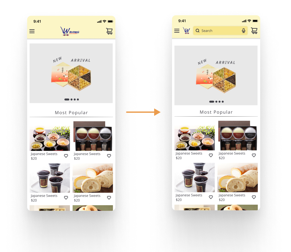
After the usability testing, we added the search bar on the home page.
The search bar is prominent and easily accessible, and users can use voice search as well. As the result, it increased the transaction revenue. This solution should seamlessly connect users to items that they have in mind.
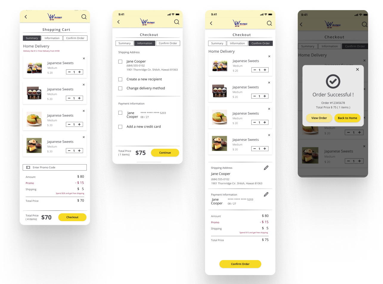
Too long checkout process and couldn't see the total order cost up-front affected the orders being abandoned by 17% and 16%.
*Source: BaymardAccording to the usability studies, we revamped our checkout process. We simplified the checkout process into 3 stepped processes, and let users could see the total order cost at the first step. We found that reduce checkout abandonment.
Final Design
The checkout process initially is 5 steps, after the usability testing we revision in 3 steps.
Users can easily see the steps and edit all the information quickly.
Accessibility considerations
1. The Contrast Ratio of all screens reaches the AAA level.
2. Used icons to help make navigation easier.
3. Enable the voice search features.
4. Give each screen a unique title and provide headings that identify sections in your information hierarchy and make these interactions available to VoiceOver/Talkback users as well.
Takeaways and what i’d do in the future
Take it one phase at a time
For changes to the product to match the changed behavior of customers during the pandemic. We learned to break down complicated designs into small, manageable chunks. This eases development and handles bugs as we go along.
Post-launch optimization
This is a crucial next step for every UX improvement or product launch. With informed, actionable insights, we are able to design a better experience for our consumers.